
Kickstarter Campaign

Click here to view the campaign
Steven wrote a good amount of the copy on this page and I either provided feedback or edited it.
Admittedly, I was more concerned with our pricing strategy, social campaigns, PR mentions, photography, and video assets than I was the fine details of our campaign copy. Most of my work is now lost on the site or on social media.
The use of images as headers was something I added to bring some sense of brand to our page. It wasn’t but a month before the campaign that I began to help at Specdrums, hence the weak title, so I was hustling to fill any gaps needed to round out the campaign. By the end of the campaign, the core team was Steven, Jack, Jenna, and myself.

This isn’t an example of content that will work for Turbo Tenant. But the story behind it is relevant.
After years of producing content that was polished and cinematic for clients, I realized that for Specdrums, more down to earth and organic videos could be not only more efficient to produce, but more effective too.
Letting your distribution channel and audience inform aspects of your production is still a good call. If I had to choose a brand to model top of funnel ads after at Turbo Tenant, Monday dot com’s ads certainly come to mind.
One quick copywriting assignment from Sphero

Screenshot from the Sphero Specdrums product page in 2019 before a website redesign in 2020.
My favorite rule of thumb is the rule of three. Like all great designs, less is more. If visitors of the Sphero Specdrums product page did not grasp these three things, they wouldn’t have a foundation of understanding to view any other information about the product. (Another great example is this blog post.)
Sphero’s original intent for this prominent visual section on Specdrums product page was to discuss the technical specifications of the light sensor, accelerometer, firmware, and more. During a pre-launch web review meeting, I generated consensus around repurposing the section to provide the product’s essential elevator pitch, something that was absent on the page. Within about 20 minutes after the meeting, I drafted what would become this section of copy.
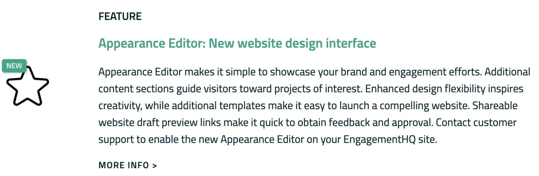
Release Notes Page
Bang the Table
Within a month of joining Bang the Table, I presented the idea of listing all of our newest features on a single page. While Bang the Table maintained the habit of releasing one-off feature announcements via blog posts, emails, and/or helpdesk articles, the information became increasingly difficult to revisit over time. If a client tuned out for a month, it was hard for them to catch up.
This new section of the site took about an hour to prototype with a colleague following our weekly marketing meeting. The team applauded the wireframe, so I drafted small sections of copy to articulate the value of each feature. We released the page and it was my responsibility to update it after each new feature was released.


LinkedIn posts
The Wayback Machine
In college, I worked with home builders and real estate agents to film property tours and provide Matterport scans.
The Matterport service that I brought into life back in 2015 still operates around OKC today.
Fun fact: I got to chat with the founder of Matterport (Matt Bell) at an Office Depot in San Fransisco during a final supply run before Tech Crunch Disrupt began.